June 10, 2026
Rado's Blue Captain Cook Ceramic Chronograph Works Best When It Fully Commits to Excess
The latest Rado Captain Cook ceramic chronograph is too big, too shiny, and too committed to subtlety's opposite to apologize for itself. That is exactly why this blue tri-tone version makes more sense than a restrained one would.
Rado's Blue Captain Cook Ceramic Chronograph Works Best When It Fully Commits to Excess
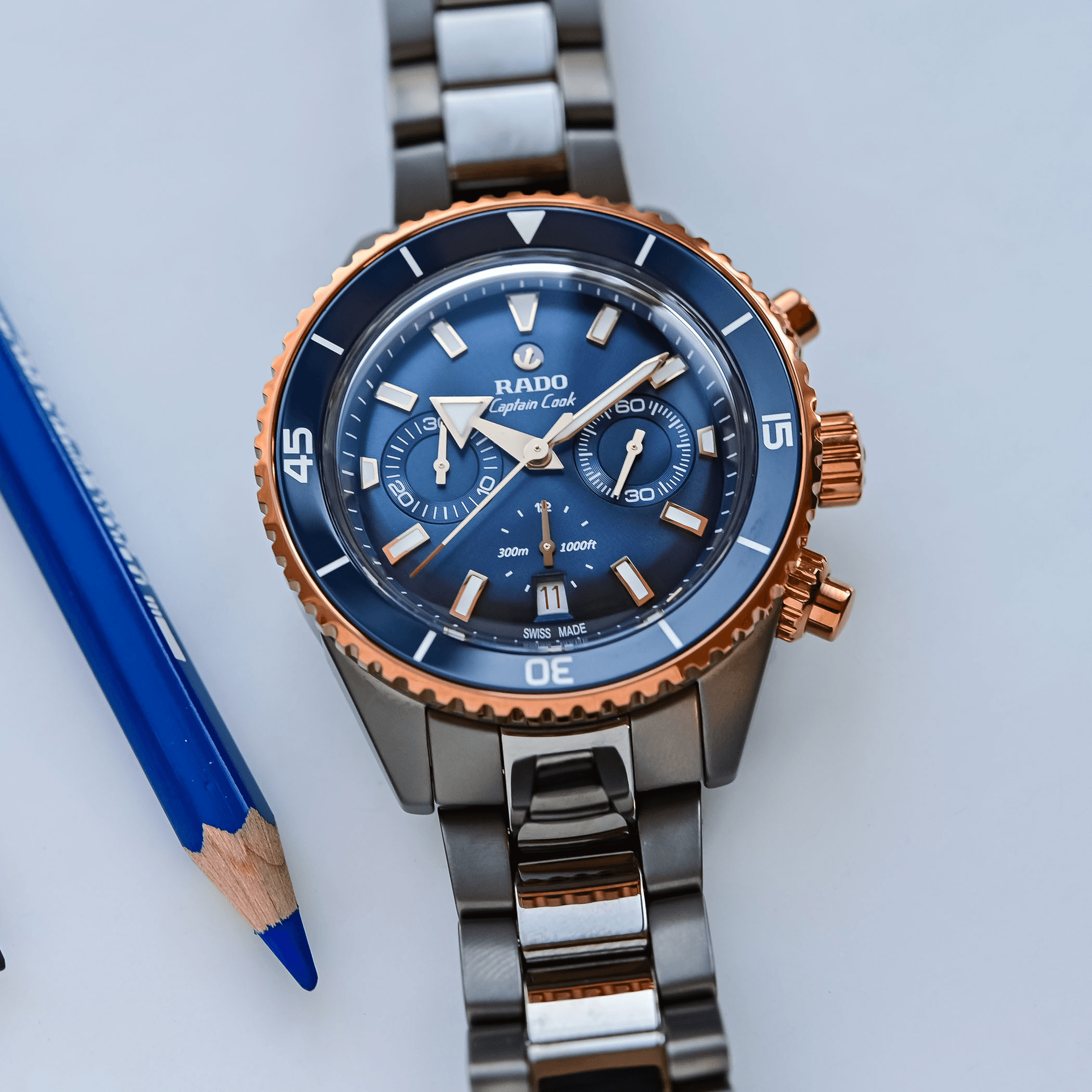
Some watches only make sense once they stop pretending they might be practical minimalism. The new blue-dial Rado Captain Cook High-Tech Ceramic Chronograph is one of them. At 43mm wide, nearly 50mm lug-to-lug, and 16.2mm thick, this is not a watch for anyone seeking understatement. But that is also the point. Once you accept that Rado is building a ceramic dive chronograph as a statement object first and a polite all-rounder second, the watch becomes much easier to appreciate.
In fact, this blue and rose-gold-accented version may be the clearest expression of what the model is supposed to be.
Rado is better when it leans into material theater
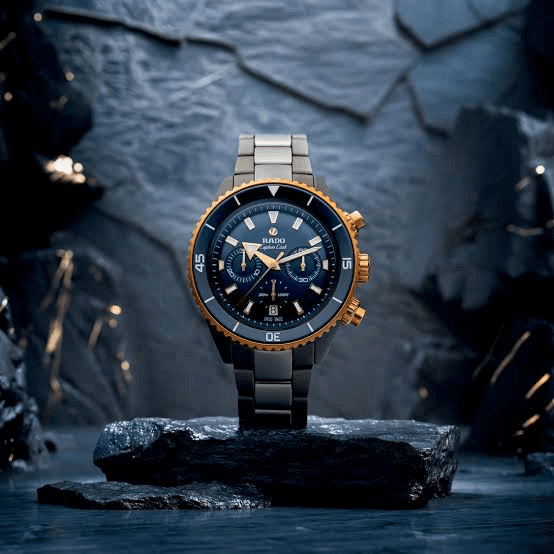
Rado's strongest modern identity still comes from materials. That is the brand's clearest claim to relevance in a market full of retro narratives and borrowed prestige codes. So when the Captain Cook ceramic chronograph arrives in a dark gray case, a blue ceramic bezel insert, a sunray blue dial, and rose-gold-toned hardware, it feels less like an indulgent styling exercise and more like Rado remembering what business it should be in.
Fratello's hands-on report points out how much visual presence this version has compared with the earlier black-and-rose-gold and gray-and-green executions. That checks out. The contrast is stronger, the color hierarchy is clearer, and the whole watch feels more deliberate because it stops trying to downplay its own flamboyance.
The watch is oversized, but not confused
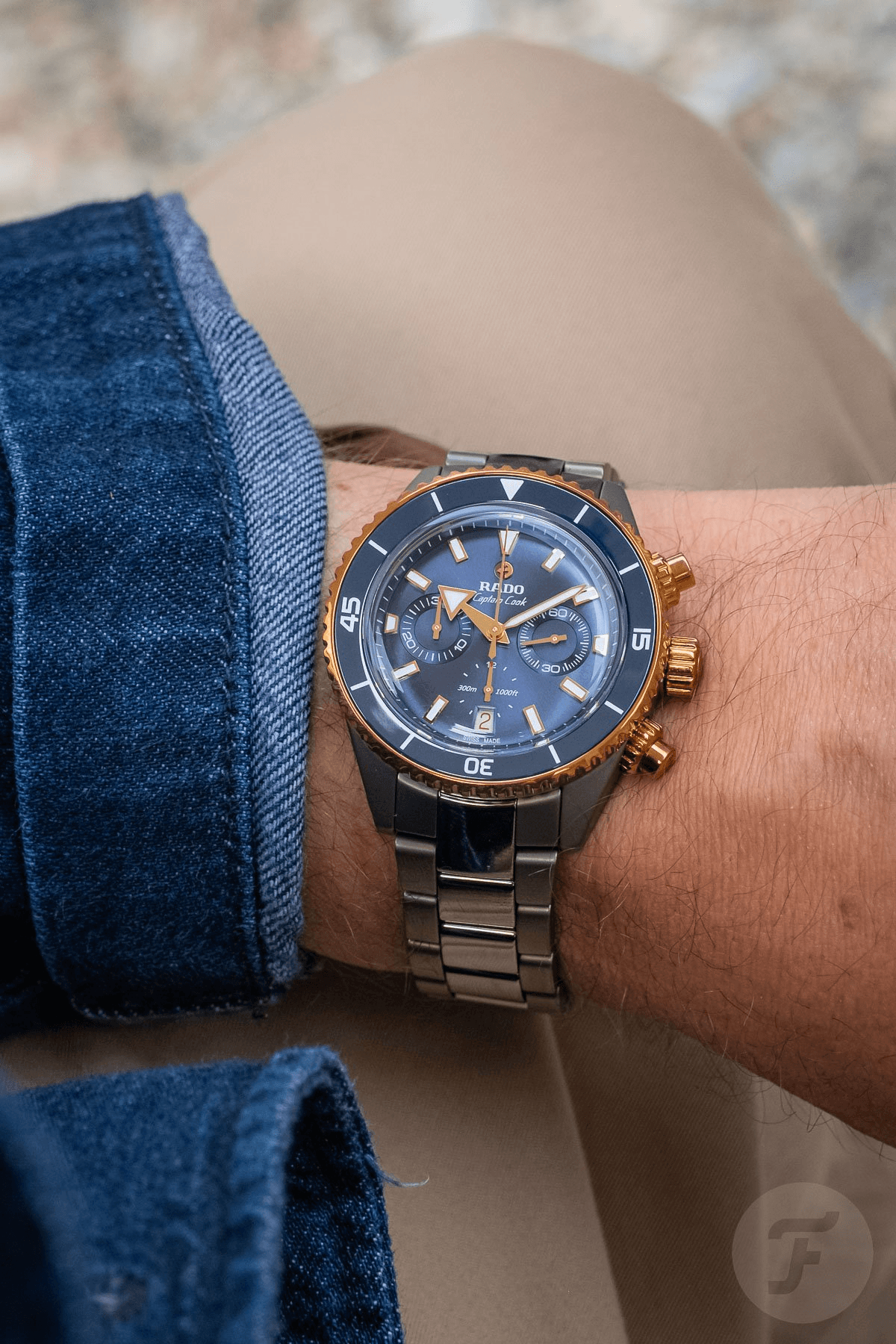
There is no need to pretend the dimensions are universally wearable. This is a chunky piece of kit with the footprint to prove it. It will not disappear under a cuff, and it is not trying to. But the shape at least feels honest to the watch's brief. A 300-meter ceramic chronograph with a module-based automatic movement was never going to become a slim everyday stealth object.
That honesty matters. Oversized watches are most annoying when they seem unaware of what they are. The Captain Cook ceramic chronograph looks fully aware. Its scale, polished center links, colorful metal accents, and crowded dial all point in the same direction.
The dial gets the balance mostly right
The classic 3-6-9 register layout helps keep the dial readable despite everything else happening around it. The depth rating tucked into the 6 o'clock counter is a smart touch, and the rose-tone hands and markers give the watch a strong enough visual spine to hold together the ceramic-and-gold contrast.
Even the strange red-on-white date display, which Fratello calls out as an odd choice, at least proves Rado was willing to let the watch be a little unruly. That is preferable to sanding down every sharp edge in the name of universal approval. A watch like this should provoke small arguments. If it did not, it would probably be less memorable.
The movement story is practical, not romantic
Inside is Rado's caliber R801, built on the ETA A31 with a Dubois Dépraz chronograph module, plus a Nivachron hairspring and a 59-hour power reserve. This is not movement poetry, but it is technically respectable and entirely appropriate for the role. The real value proposition here is the combination of proven architecture, significant water resistance, and a ceramic-heavy case-and-bracelet package with actual personality.
That is where the watch either wins you over or does not. It is not selling artisanal finishing. It is selling tactile, visual, unapologetic product presence.
Why this version works better
A more muted take on this watch would probably be easier to recommend, but it would also be less convincing. The blue tri-tone version succeeds because it commits to a stronger identity than many large luxury sports chronographs are willing to risk. It does not aim for neutrality. It aims for impact.
That puts it in a narrower lane, but it is a clearer lane. For the buyer who wants a ceramic chronograph that feels materially modern, visibly expensive, and just a bit theatrical, this Rado makes a stronger case than a safer one would.
The real takeaway
The blue Captain Cook High-Tech Ceramic Chronograph is not good because it balances every taste perfectly. It is good because it does not bother trying to. Rado finally lets the watch behave like the object its specs and materials always suggested it wanted to be.
When a design this extroverted fully commits, it stops looking like too much and starts looking coherent. That is the trick this watch pulls off.
Share this piece
Send it to another watch nerd.
Keep reading
Related articles
June 12, 2026
Makina's Cassiel II Shows a Brutalist Chronograph Can Feel Deliberate Instead of Costume-Like
June 12, 2026
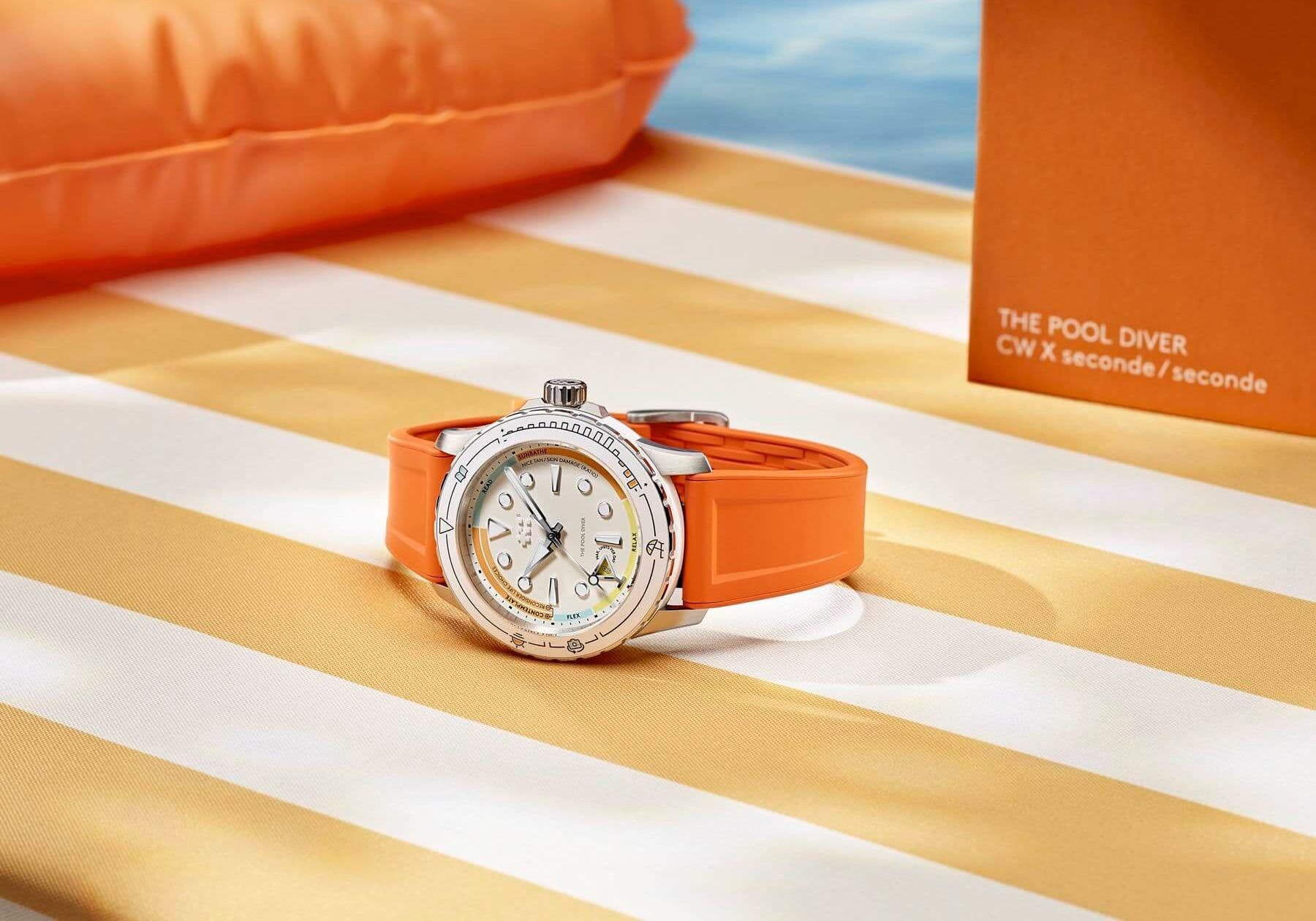
Christopher Ward's C60 Pool Diver Joke Works Because the Watch Still Understands How to Be a Real Dive Watch
June 12, 2026
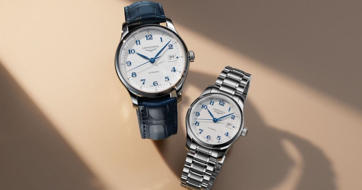
Longines' Master Collection Finally Feels Like a Complete Dress-Watch Platform Instead of a Single Safe Compromise
About the author